PROJECT
Branding, naming and packaging
CLIENT
Ekoa Yerba
EKOA
2018Design strategy to enhance a Yerba Mate brand.
Entrepreneurs from the southern region of Paraná, a state in Brazil, with extensive knowledge of yerba mate planting and production, recognized an opportunity to launch a product anchored in quality
[native yerba mate] and purity [premium yerba mate].
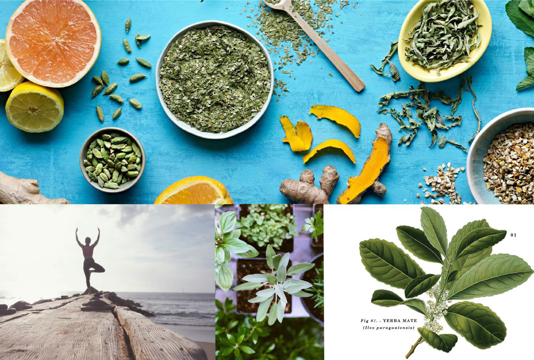
At the start of the project, ZON studied all elements of the new brand - including planning, positioning, naming, brand design, and packaging. Immersion in the product's universe and market [cultivation, production, point-of-sale image, and consumption] defined the structure of the new brand, proposing various design strategies. The chosen concept, "Origin," draws inspiration from the indigenous Guarani legend, which recounts the story of Yerba Mate and speaks of the roots and rites of tribal coexistence related to this beverage.
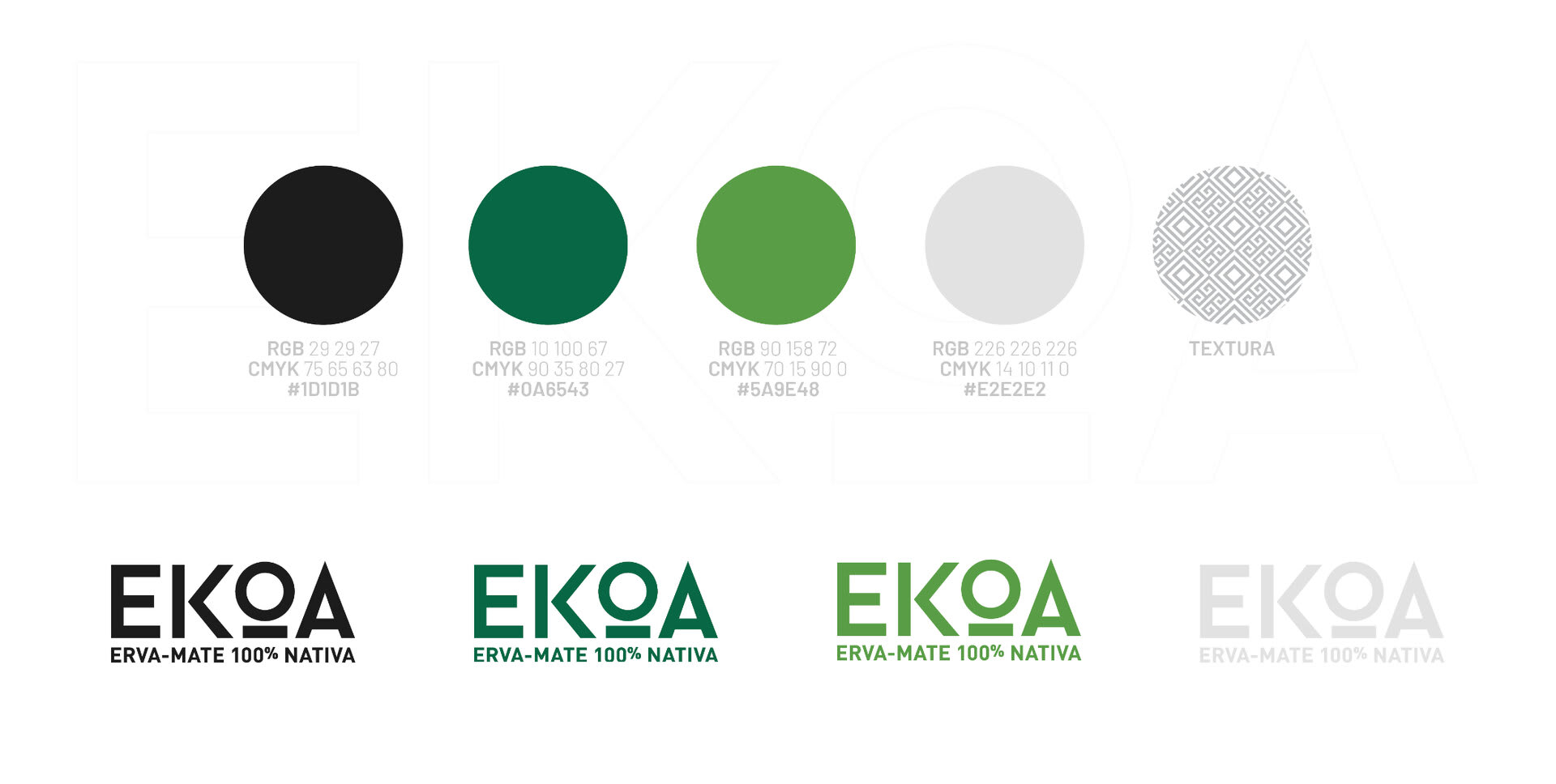
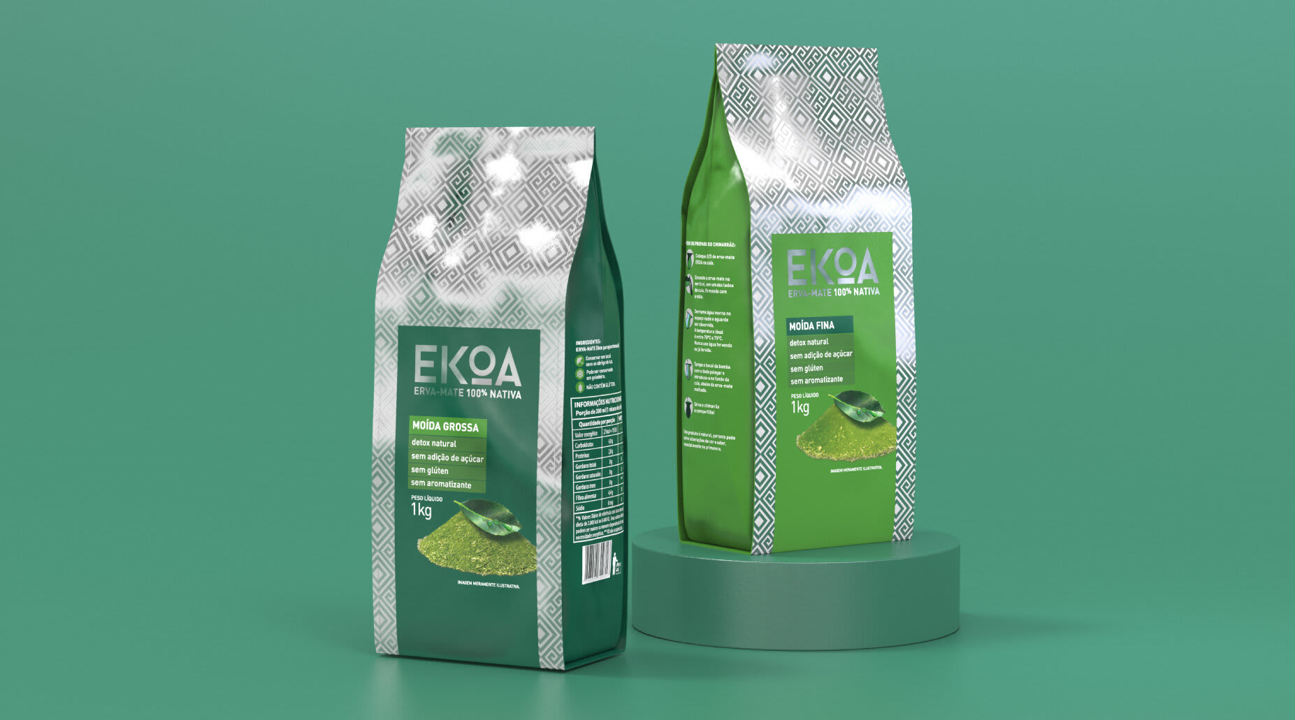
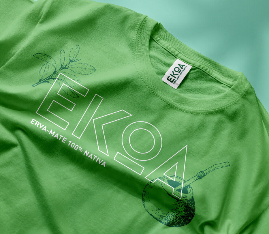
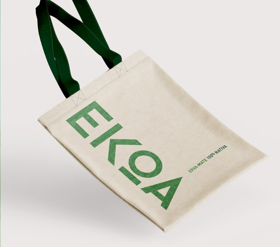
The new brand takes on the name Ekoa, which means Village in Tupi-Guarani. The imagery of this culture, including indigenous art, provided inspiration for the graphics that elegantly "dress" Ekoa packaging.
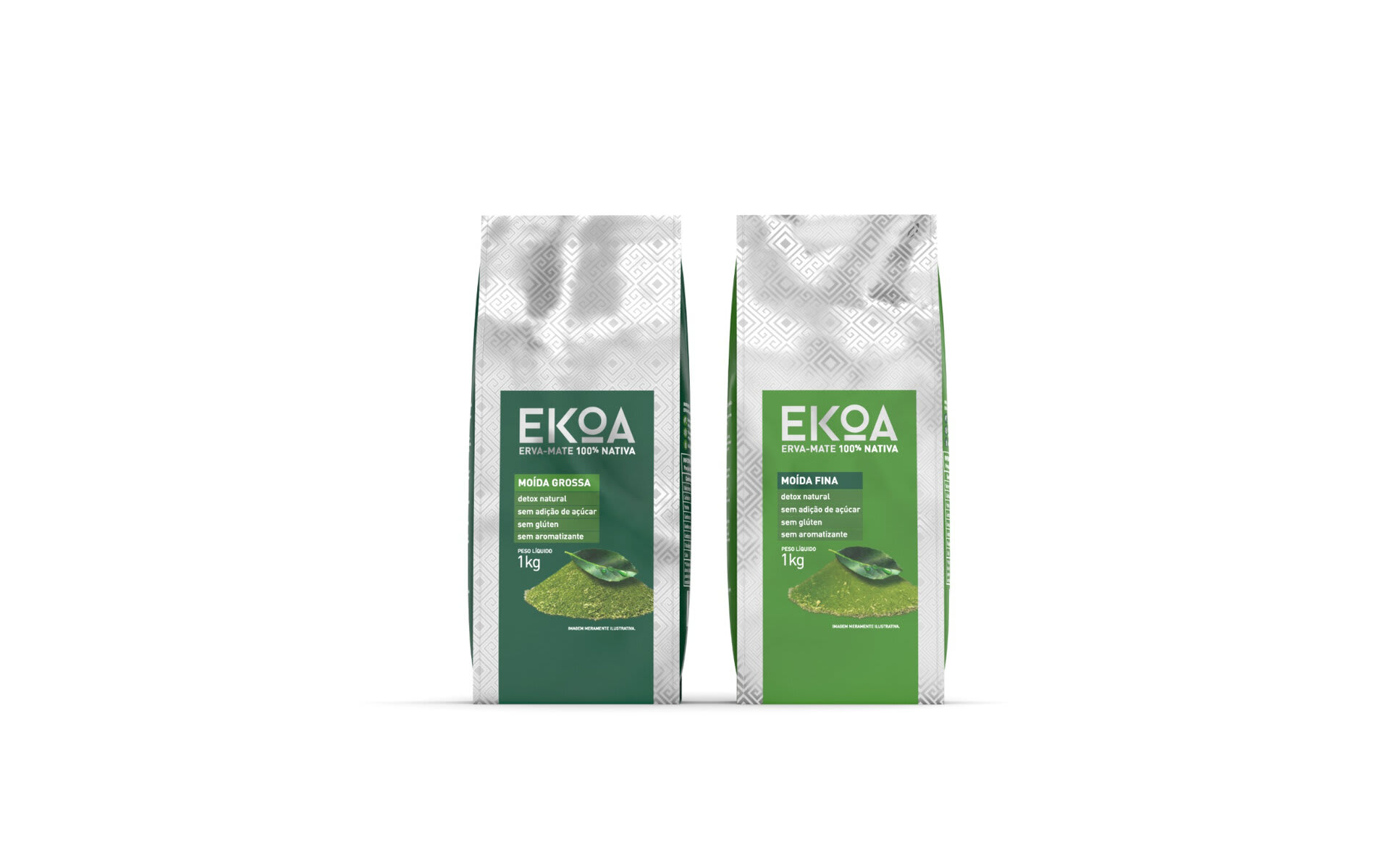
The visual result of the packaging is very distinct from that of market players, highlighting Ekoa yerba mate at the point of sale.


